Denise's Rad Art Blog Thing
Search
Wednesday, June 11, 2014
Multimedia Project
For my multimedia project I decided to use the theme of fears. The media I used were glass jars, super glue, organza bags, and purple fabric dye. This piece is about the fragility of people. It was inspired by the suicide of my best friend, Claire, about three months ago. This project was hard for me to do because it's still a very emotional subject for me, but art is supposed to be an expression of emotion, so I pushed through with it. Each jar contains a small bag of broken glass from each other jar, representing the pieces you take from other people and lose throughout your life.
Friday, May 2, 2014
A Sticky Situation
This is one project I didn't hate doing. I enjoy working with watercolors a lot more than other mediums we've used throughout the semester. Going off of the theme, I painted popsicle sticks, complete with bad jokes. I had trouble with making the two outer sticks look straight, but I'll call it character. At first I had trouble putting texture into the painting, but I found out how to make what looked like wood grain, and it became a thing I really liked in the piece.
Thursday, February 20, 2014
Scientific Sketch WIP
Anatomy is really super hard to draw, but I'm almost done! Just need to do details, facial features, hair and clothes!
Friday, January 10, 2014
How To Create an Unreasonably Hipster-looking Picture


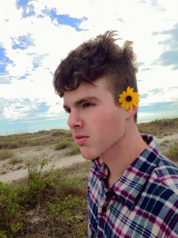
Step one: Take a photo that has the potentiality of being really hipster. Like this one here, flowers, beaches, and plaid usually works well. The more vague the emotion on the face, the better.
Step two: Clean it up. Brighten the colors a bit, smooth out blemishes, and even out the skin tone a bit. Hipsters like clear skin. If the subject looks slightly androgynous, you're doing it right.
Step three: Turn the picture into a smart object. Make a duplicate layer of it and put a gaussian blur filter on it. Make sure all objects are distinguishable. Change the layer mode to screen, and then your photo has a bloom effect. You can tone the effect down like I did by right clicking the layer, going to 'blending options', and sliding the top slider back and forth till you're happy.
Step four: Add another adjustment layer, this time the 'black and white' one, set the blending mode to 'overlay', and adjust the opacity until you're happy. This creates a really lo-fi sorta look, and you can adjust it to be a different color exclusion/inclusion set.
Step five: Now we are going to add a retro color effect to the photo. Start by adding a Color Fill adjustment layer (Layer > New Fill Layer > Solid Color). A window will appear asking you to select a color. Don’t worry about the color for now; just click OK. Change the blending mode of the layer to Exclusion then reduce the opacity to 25%. Now worry about the color, double click on the color fill and choose whatever you want. Seriously. Different colors make for different outcomes.
.JPG)
Step six: Add a bunch of lomo light leaks in new layers over your picture. Set the blending mode to screen, and go crazy! Warp the shapes, play with the opacity, put them wherever, just don't go overboard. Scroll down to see the finished product!
.JPG)
Tada! This is how you make your photos unreasonably hipster-looking!
Friday, December 20, 2013
Tuesday, December 17, 2013
Subscribe to:
Comments (Atom)


.JPG)
.JPG)
.JPG)
.JPG)
.JPG)
.JPG)
.JPG)
.JPG)
.JPG)
.JPG)
.JPG)
.JPG)
.JPG)


